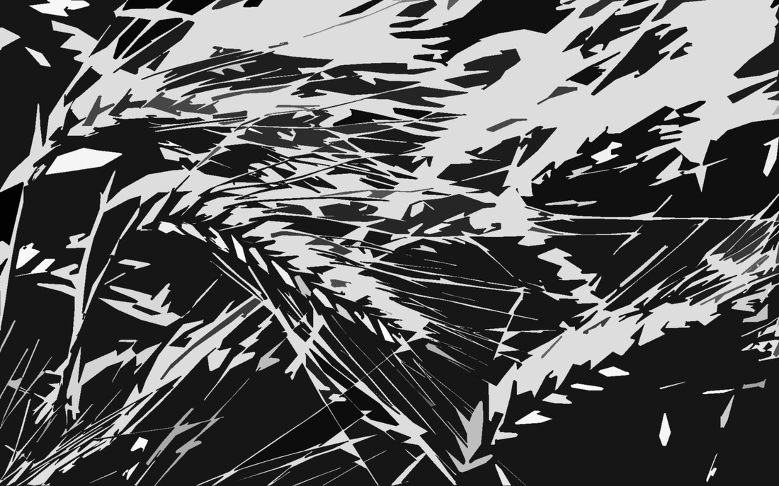
To create this effect I performed a number of steps on a photo of wheat blowing in the wind. To create this effect, I first used the posterize adjustment, creating four levels. I then used the threshold adjustment to even tones between black and white parts of the picture. I then used the cutout filter under the "artistic" window go add a sense of fidelity to the slight edges of the wheat. This combination of adjustments and filters works best on pictures that seem to be in motion and have jagged, rough edges to them.
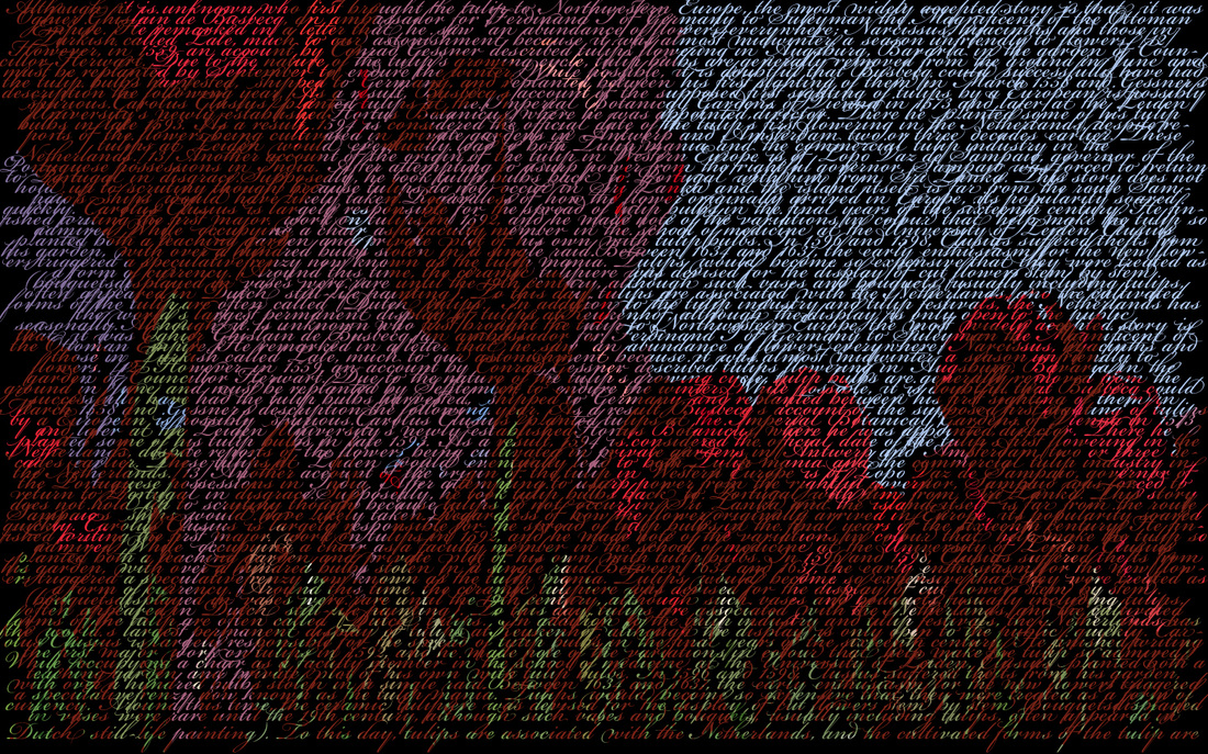
To create this image I used a picture of tulips and a few paragraphs on the history of tulips. I first saturated the tulips by about 60, then I used the cutout filter under the artistic window. After this, I inserted the text and adjusted it to fit the frame and centered it. I used the character tab to adjust the spacing of the words and lines. Then I created a clipping mask over the text so that the image only appeared through the constraints of the text.
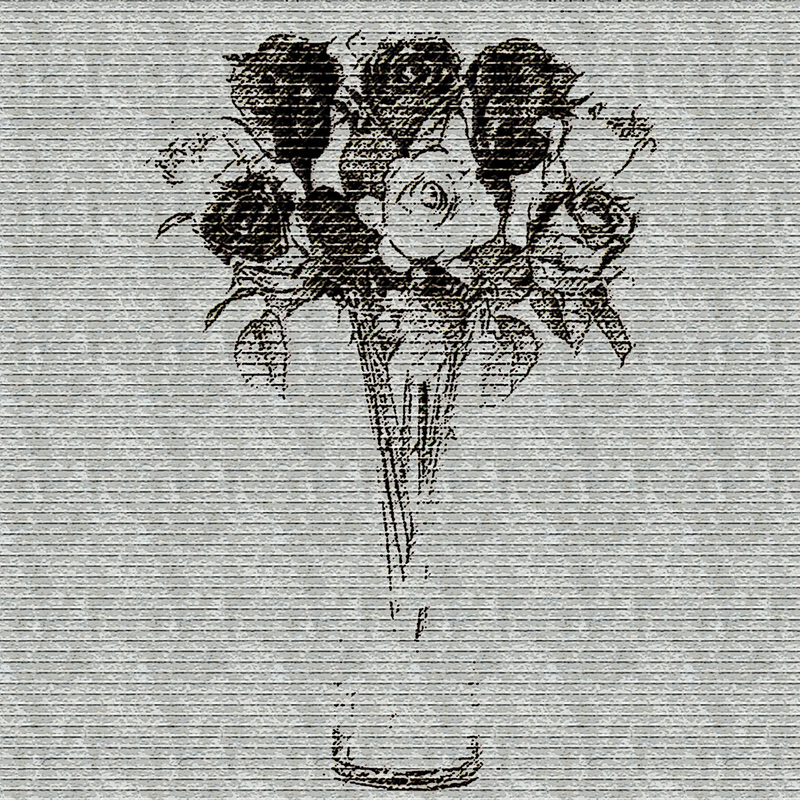
To create this image, I started with a group of roses in a vase in a white background. From this point i used the threshold tool so that the vase was barely visible except from the bottom edge. I then used the ink outline and angled strokes filters under brush strokes to finish the flower. From here I used the texturizer tool to add a brick texture to the image.
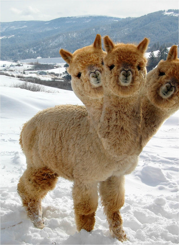
To create this image, I found an image of an Alpaca. I then selected the Alpaca's head and neck using the pen tool. I duplicated the layer three times using the transform tool to rotate different heads slightly to the left or right, leaving one in the middle. I then used the clone stamp tool to adjust the edges of the necks so that they fit and to mix some of the fur patterns up so they wouldn't be the same. I then used the burn and dodge tools to make it darker at different angles and to make the fur seem different.
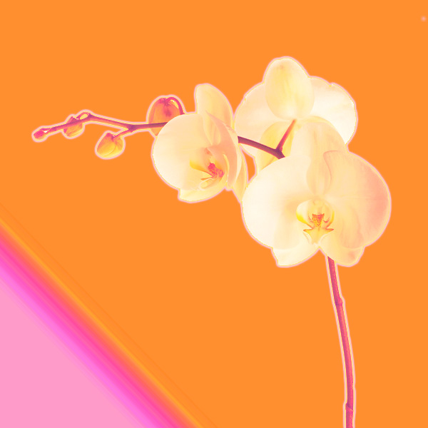
To create this effect, I had two layers: a completely empty background layer and a layer with a flower(only the flower). I first used a photofilter with an orange, brighter effect. Then I used the gradient map to find a orange/pink gradient. Apply the map as an COLOR. Then I applied an outer glow to add a brighter effect. In the background layer I used the gradient tool with a orange/pink gradient, similar to the one used with the map.
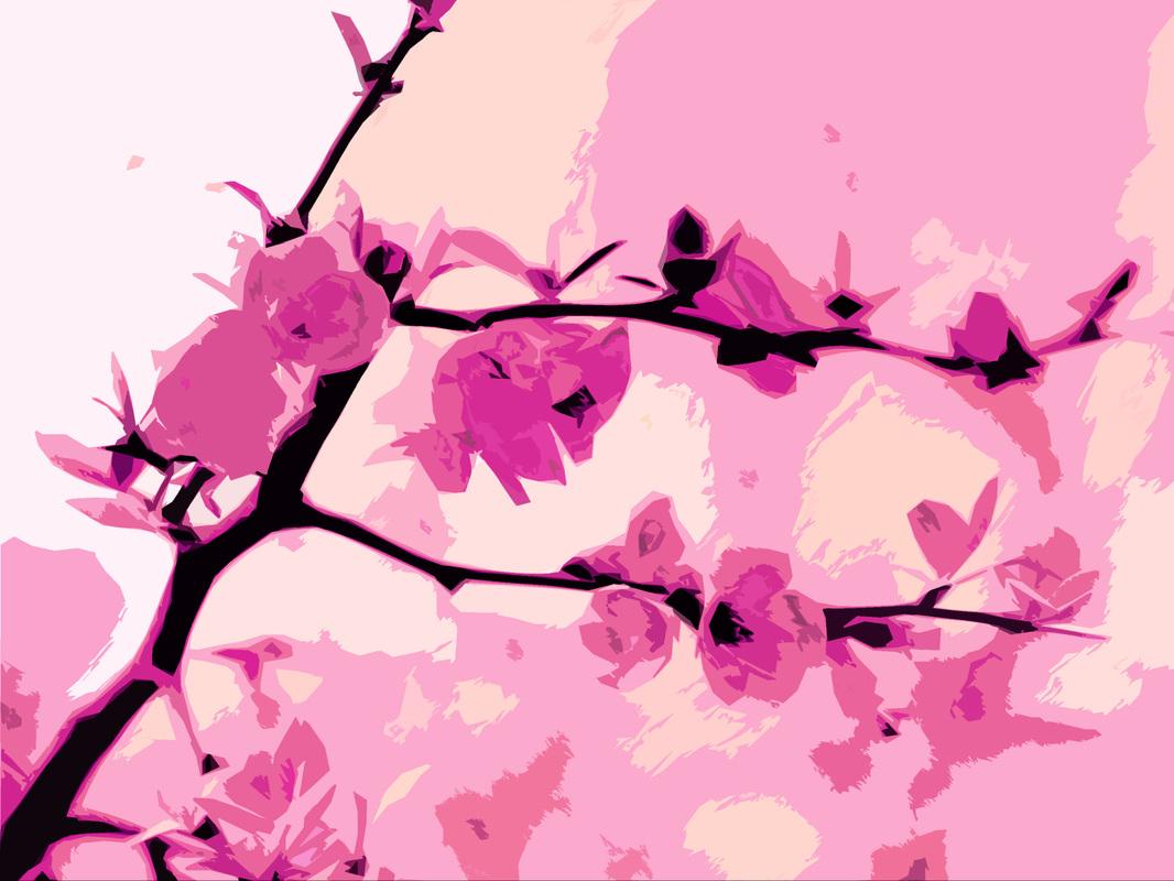
To create this image, I used a photofilter that matched the flower's general color. Then I created a gradient map that also matched the flower's general color and set the layer to "color." After this, I used the darkstroke filter on the flower layer and followed that with the cutout filter.
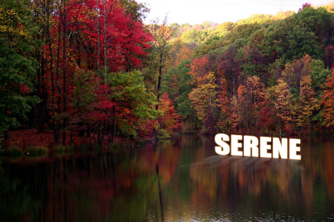
To create this image, I first found a background image, then I made text saying "serene" and duplicated the layer. I then used the transform tool to adjust the second layer so that it seems that it is being reflected over the water. I then adjusted the opacity of the second text layer and used the eraser tool with adjusted opacity levels to make the text transparent from the bottom of the text up towards the first text layer. On the first text layer, I used the layer styles of s

To create this, I started with an image of someone holding a growing plant in their hand. I then posterized the picture into 4 parts. After this I used the cutout filter under artistic and selected the highlights, midtones, and shadows, BUT WAIT. Before I selected these, I selected the green plant in the photo and cut it from the picture to recopy the piece after I color the layers. I then used the fill tool on the three layers to make the shadows a dark blue, the mid-tones red, and the highlights a cream color. From here, I combined the three layers and used the cutout filter again to clean up the lines. I then used the type tool to type in the word "Savior" using a bold font.
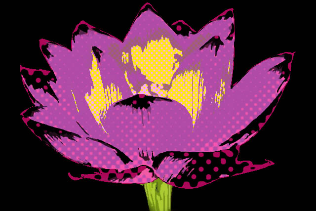
To create this image, I started with a picture of a flower. I then cut out the background of the image so that only the flower is present. After this, I posterised the layer into four parts and used the cutout filter. Then I used the select color range tool to make three different layers of highlights, midtones, and shadows based on the original layer. I then selected the main colors of the lighter layer which happened to be yellow and orange, putting yellow in the foreground color area and orange in the background color area based on how light the colors were. I then used the color halftone filter under sketch and set it to dots. I did this process to all three layers, starting from the color selection and adjust ing the halftone filter so the dots are smaller for the lighter layers. Because the stem was cut out of the picture after using the cutout filter originally, I had to find a new stem and use the cut out filter on it. I also added 20+ to the saturation of the stem to add a more neon look.
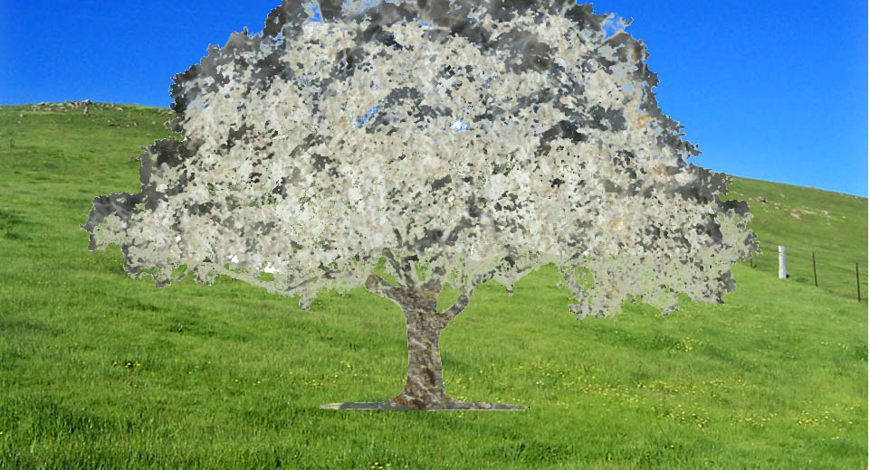
To create this image, I started with a picture of a tree. From here, I looked at the major colors of the tree using the color select tool and I made layers based off of those. I tried to stick to about 3 or 4 colors. From here, I used the pattern overlay layer style and filled each layer with textures from the rock selection and placed it in a separate background.
